
The Exalted Moonbeam
From concept to fully realized identity
Research & Logo Ideation
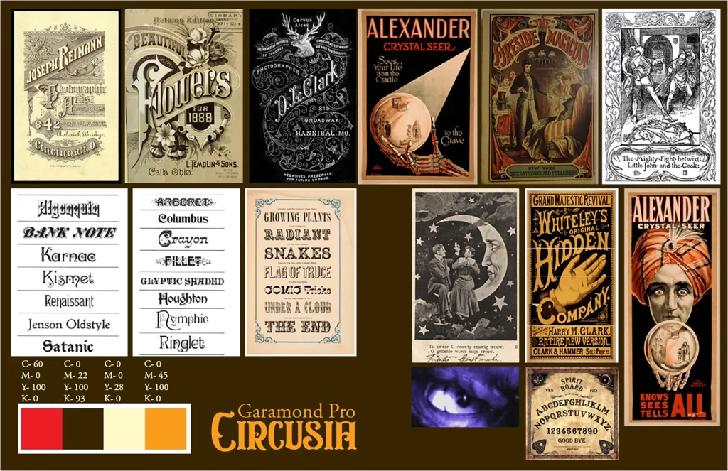
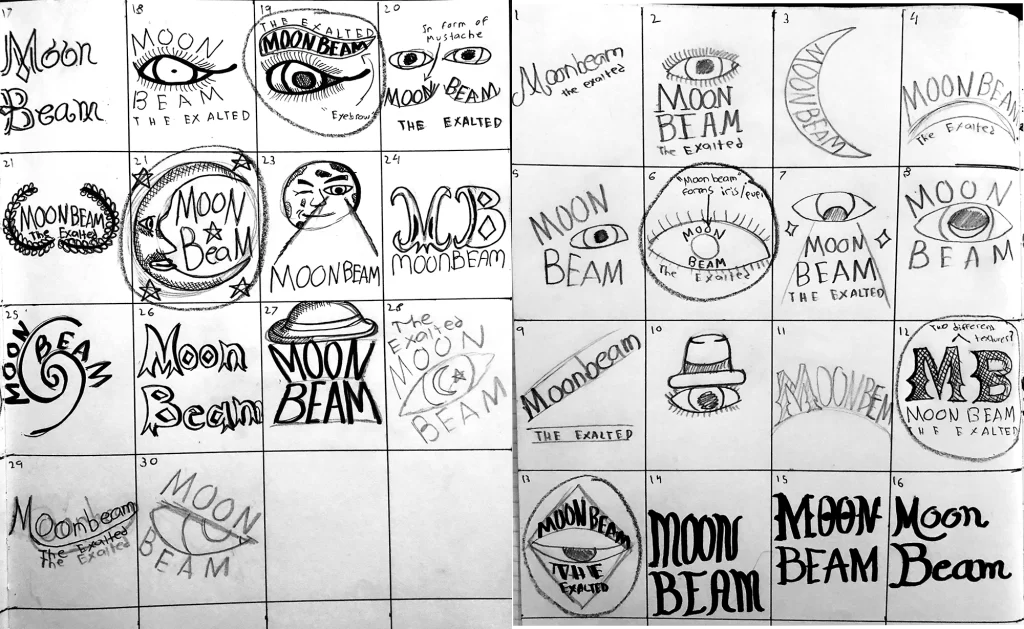
The concept was to imagine a Victorian performer and embrace the aesthetic of Victorian design. I began by researching Victorian performers and developed a mood board of the posters and Victorian typography that I liked as well as colors. This was also when I began to develop the idea for my own Victorian performer: Vincent Clarence aka “Moonbeam.” The performer who can conjure beams of light brighter than the Moon from his own eyes. From the mood board I developed sketches and an eventual logo. The Moon, eye, and a beam were key motifs.
Getting the Word Out
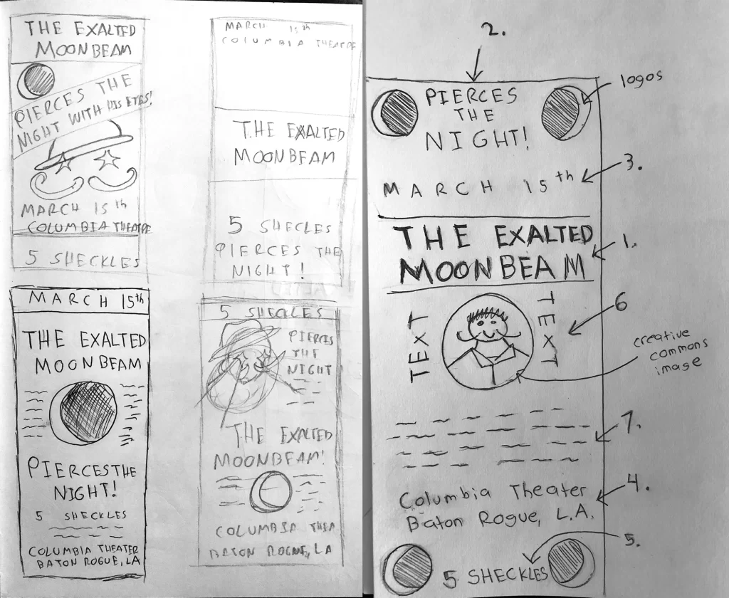
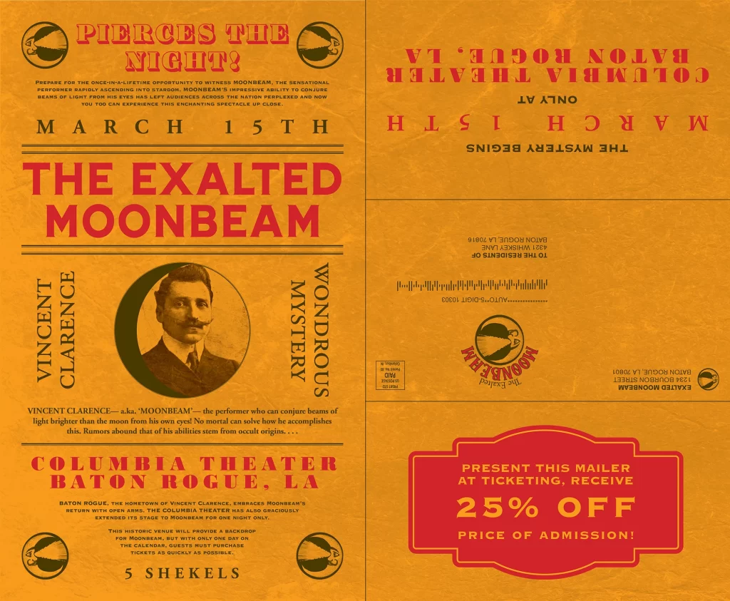
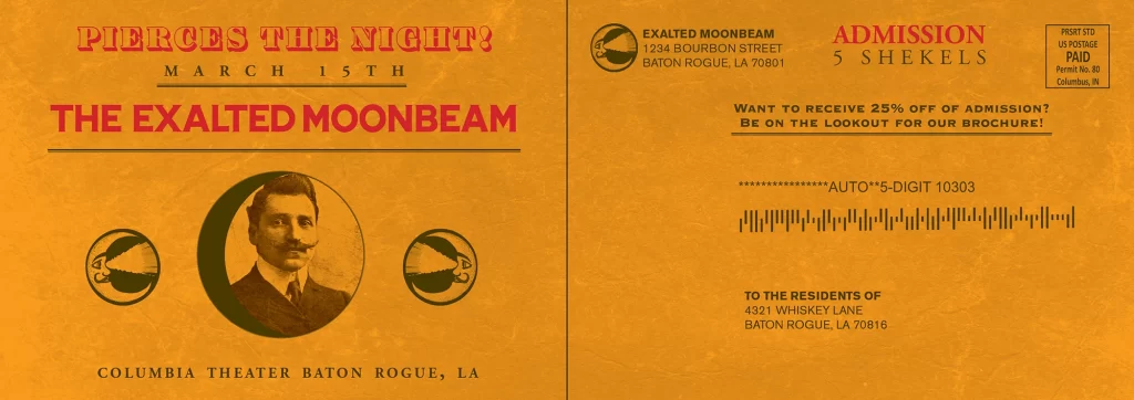
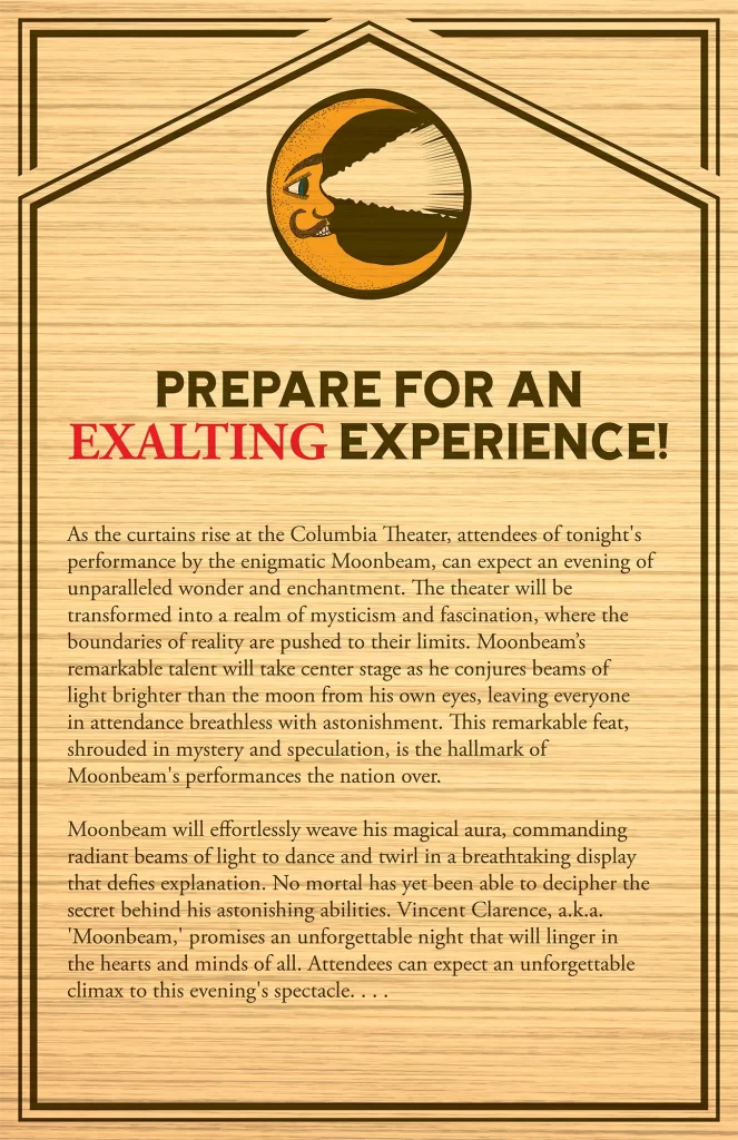
Advertising who Moonbeam is was important. This came in the form of posters, mailers, postcards, and digital ads. It was vital for the pieces, to communicate the who, what, where, when, why, and how much. Incentivizing guests to go to the performance was also critical. Each material would share the same visual language despite diverse mediums and dimensions.
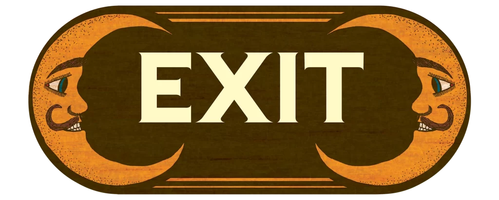
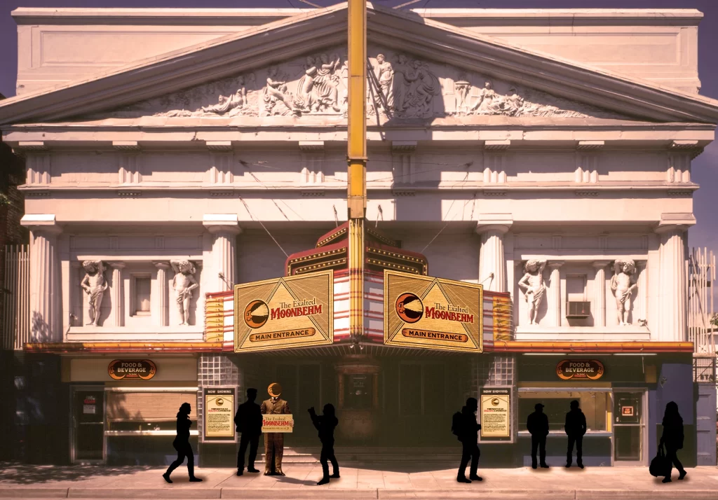
This Way, Please
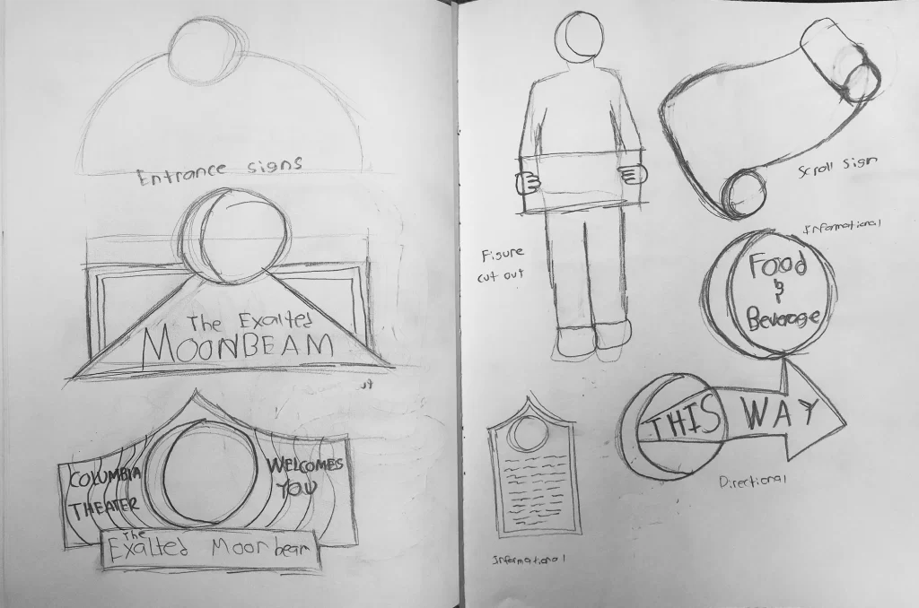
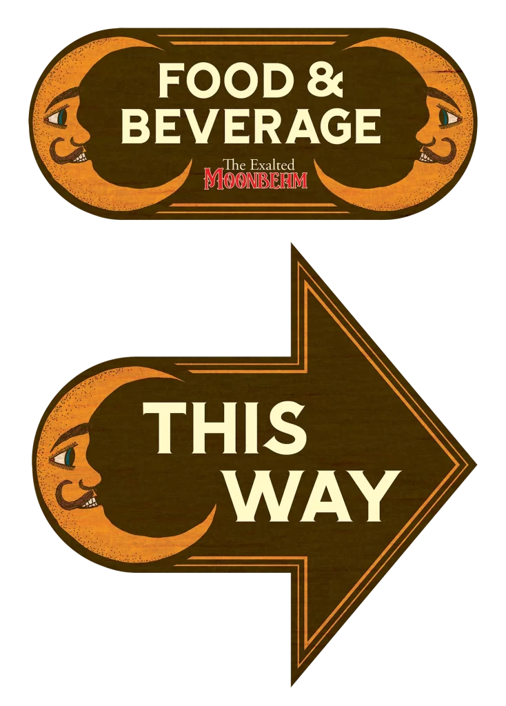
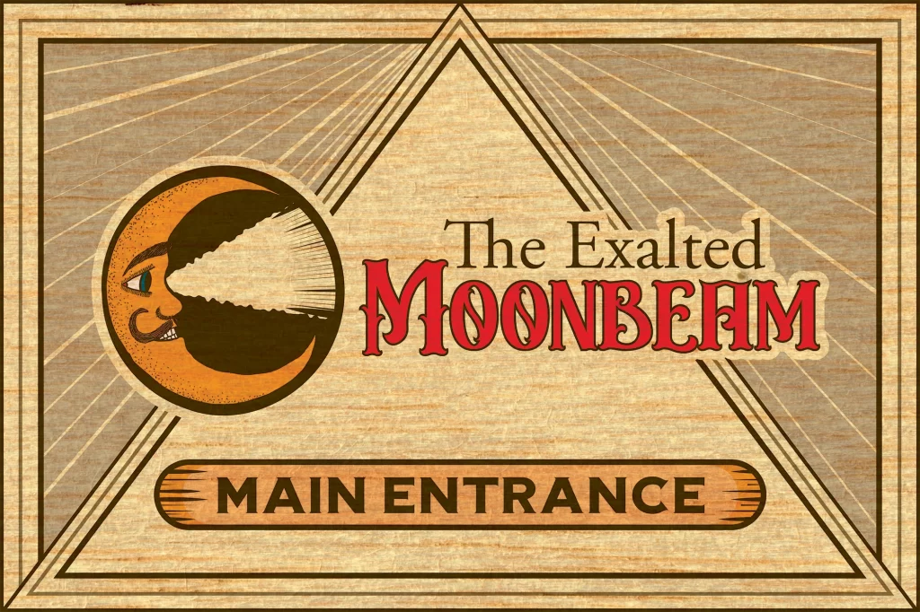
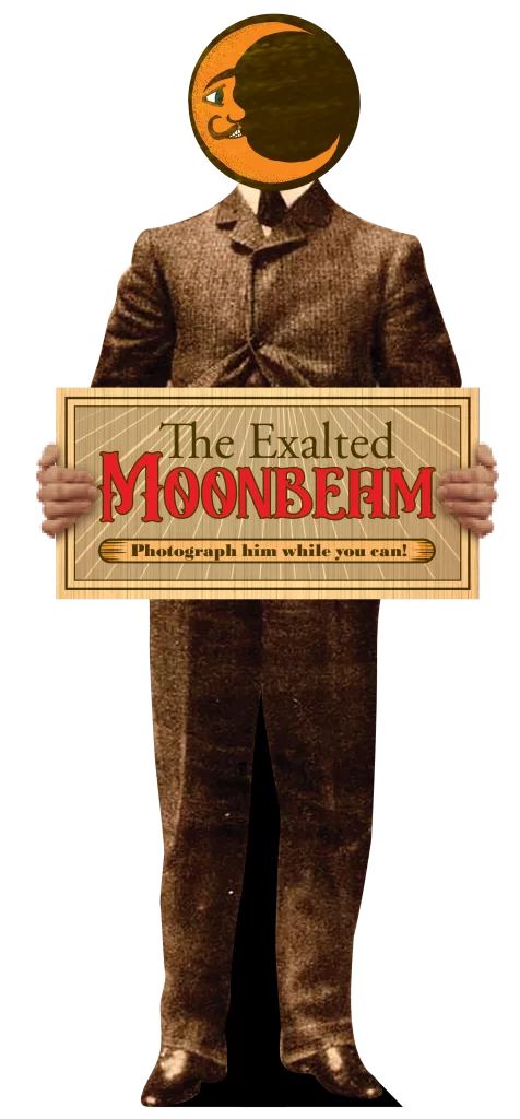
Being a performer, Moonbeam would often find himself performing at venues. Signage would play a key role in communicating with guests. I started with sketches for the main entrance sign, which would be the largest and most important sign. I then sketched signs that would serve as informational or directional signs, and even a cardboard cut-out of Moonbeam for guests to take their photo with. The color palette of orange, brown, tan and red were consistent throughout.
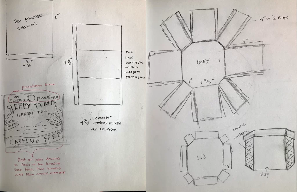
Souvenir Item
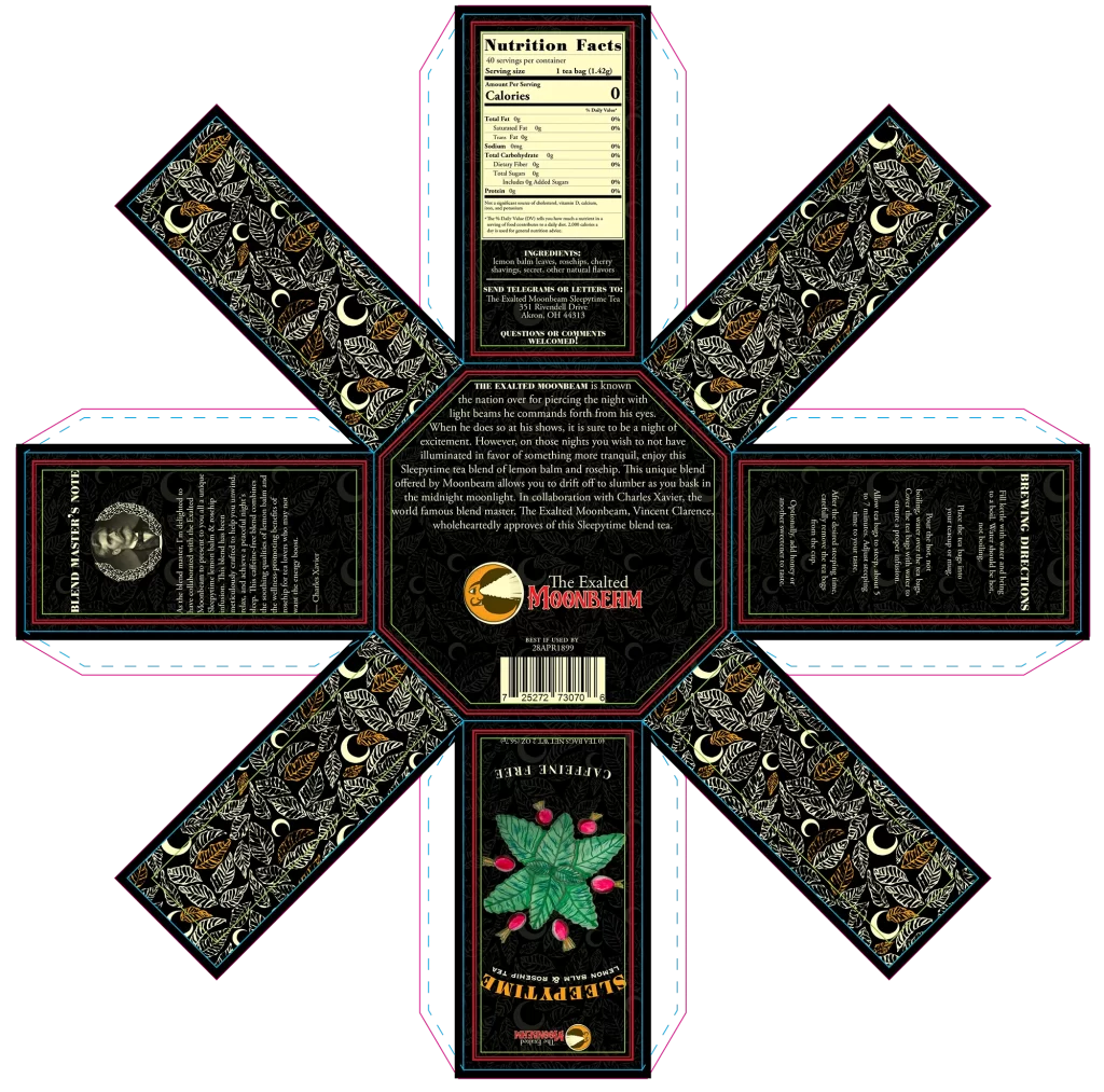
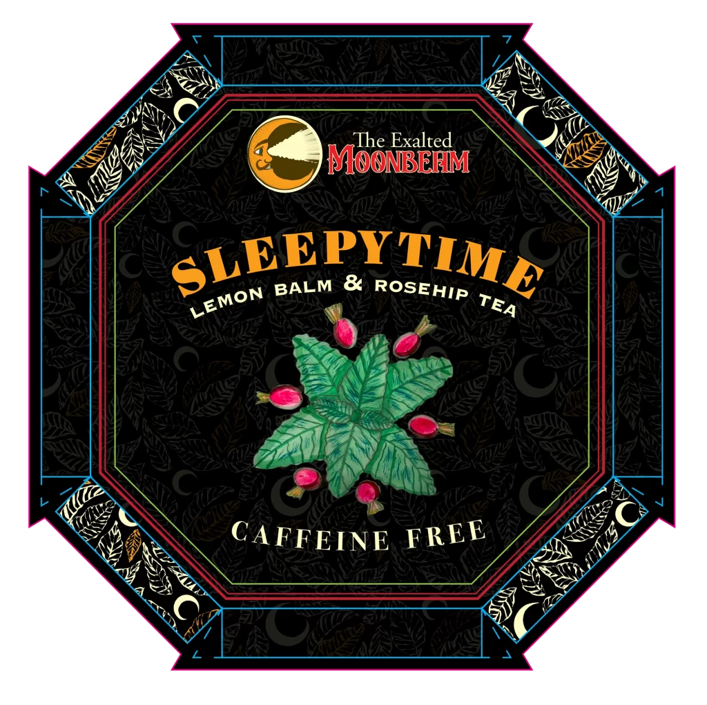
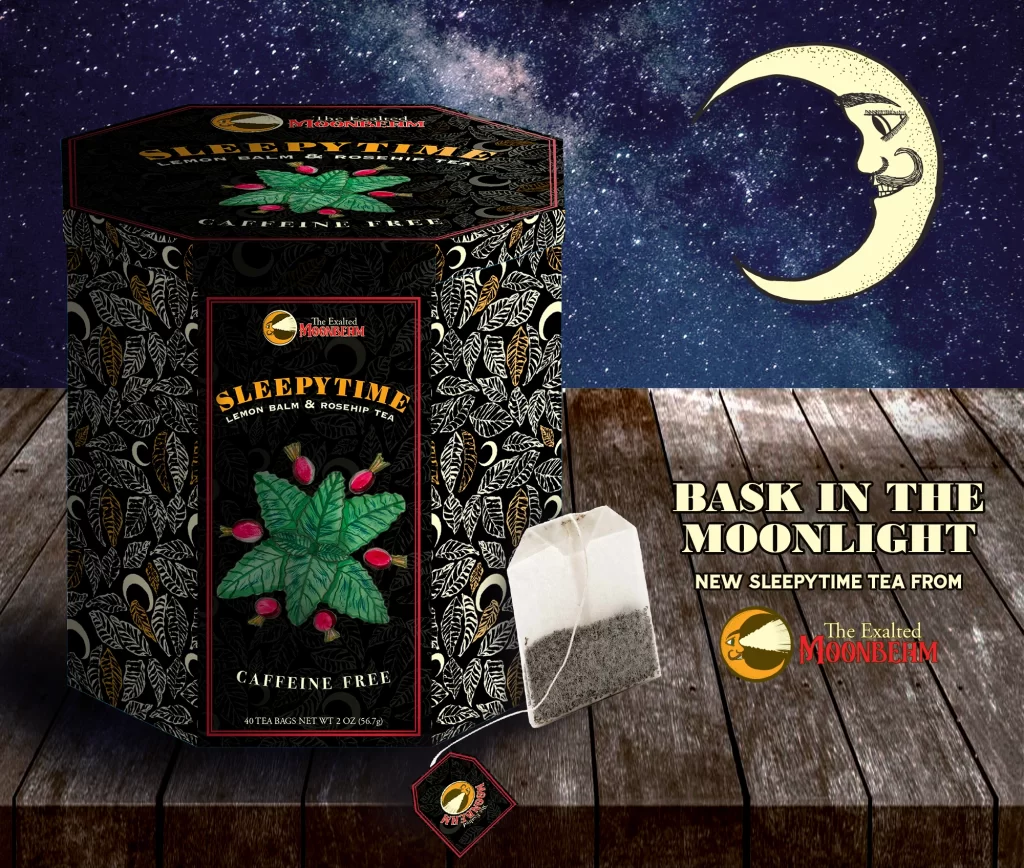
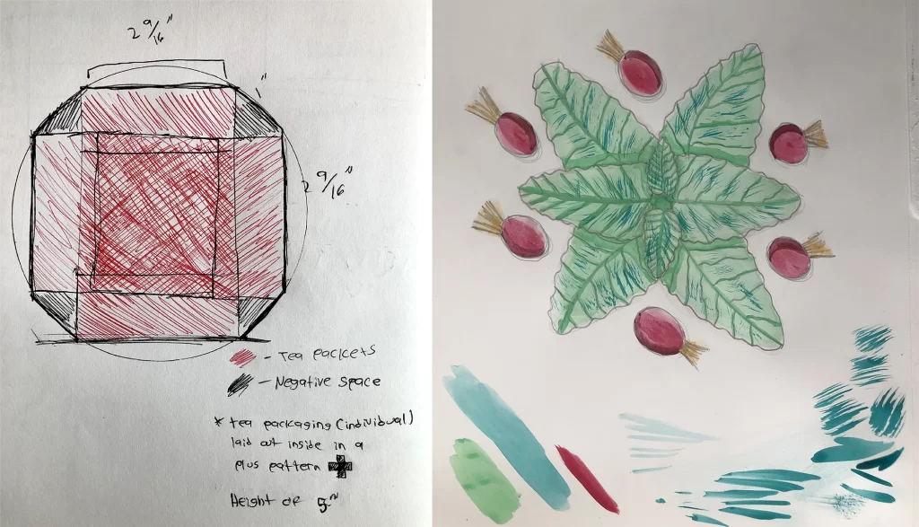
Guests to Moonbeam’s shows could also purchase Moonbeam branded tea during his shows. I picked Sleepytime tea due to its lack of caffeine. This was fitting for the Moonbeam brand being that at night, most people want to sleep or relax. I looked at vintage Victorian packaging for tea and found that some teas came in an hexagonal shape. I wanted to revive this style. I created the die-lines from scratch by first making a paper prototype based on sketches I drew to gauge how it would all be assembled. I also created a watercolor illustration of lemon balm and rose hip being that this would be the flavor of the tea
Final Die-line and Mockup
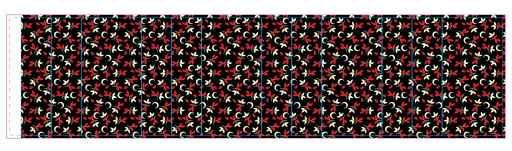
Once the die-line was created digitally, I built the visual language of the package. It was a slight deviation from the established Moonbeam brand, but retained the same typefaces. The patterns were inspired by both botanical and moon motifs. The packaging also came with an insert to keep the tea bags from shifting around. Black was the predominate color given the product’s name.