
Zoomiez Cat Toys
The development of a brand
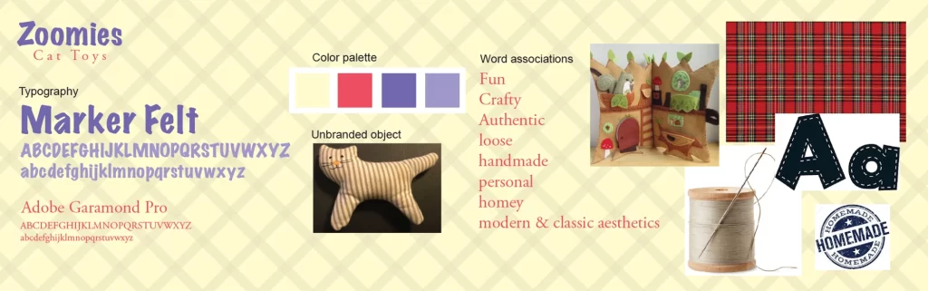
Establishing the mood
Taking a random cat toy I found in the house (the original packaging was long lost,) I aimed to create a new brand and package for it. I knew I wanted to achieve a crafty, handmade quality for the brand. I created an initial mood board to get my thoughts set on the tone of the brand. Some of the design cues changed as I progressed through the design process
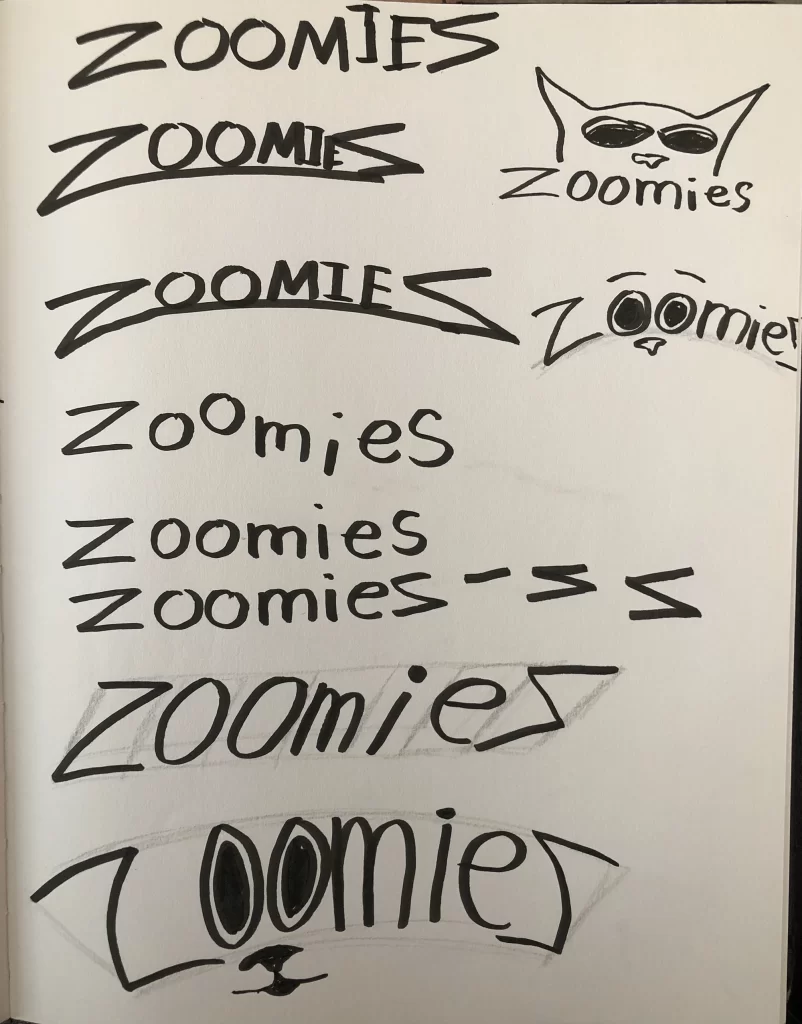
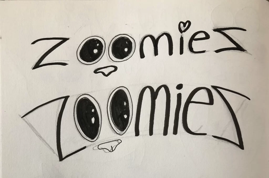
Logo Ideation
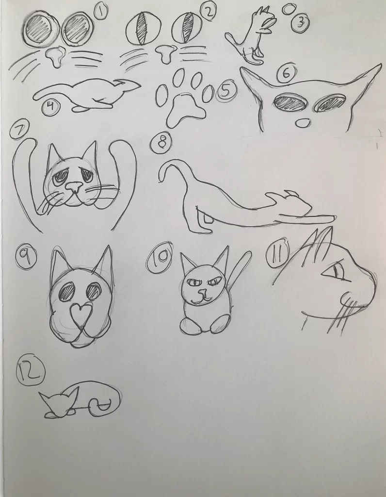
With a mood established, I began work on the logo. Initial sketches were illustrative and based on cats engaged in various activities. Then the idea of a cat getting the “zoomies” hit me. The “zoomies” is a slang term used to describe a cat when they get overly excited and begin zooming around. This concept paired well with the fact the object was a catnip toy. The logo then evolved to be typographical, focusing on the word “zoomies” with the o’s serving as the eyes.
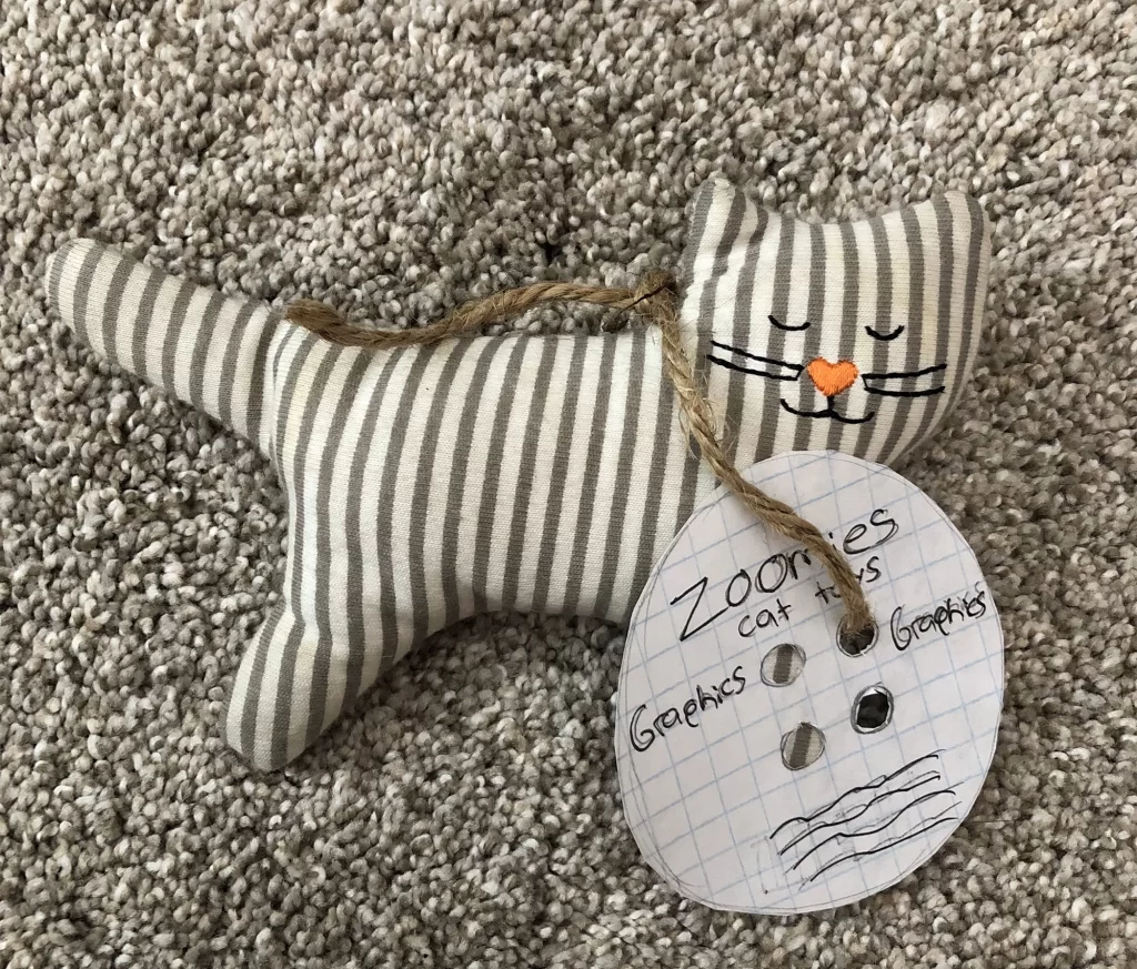
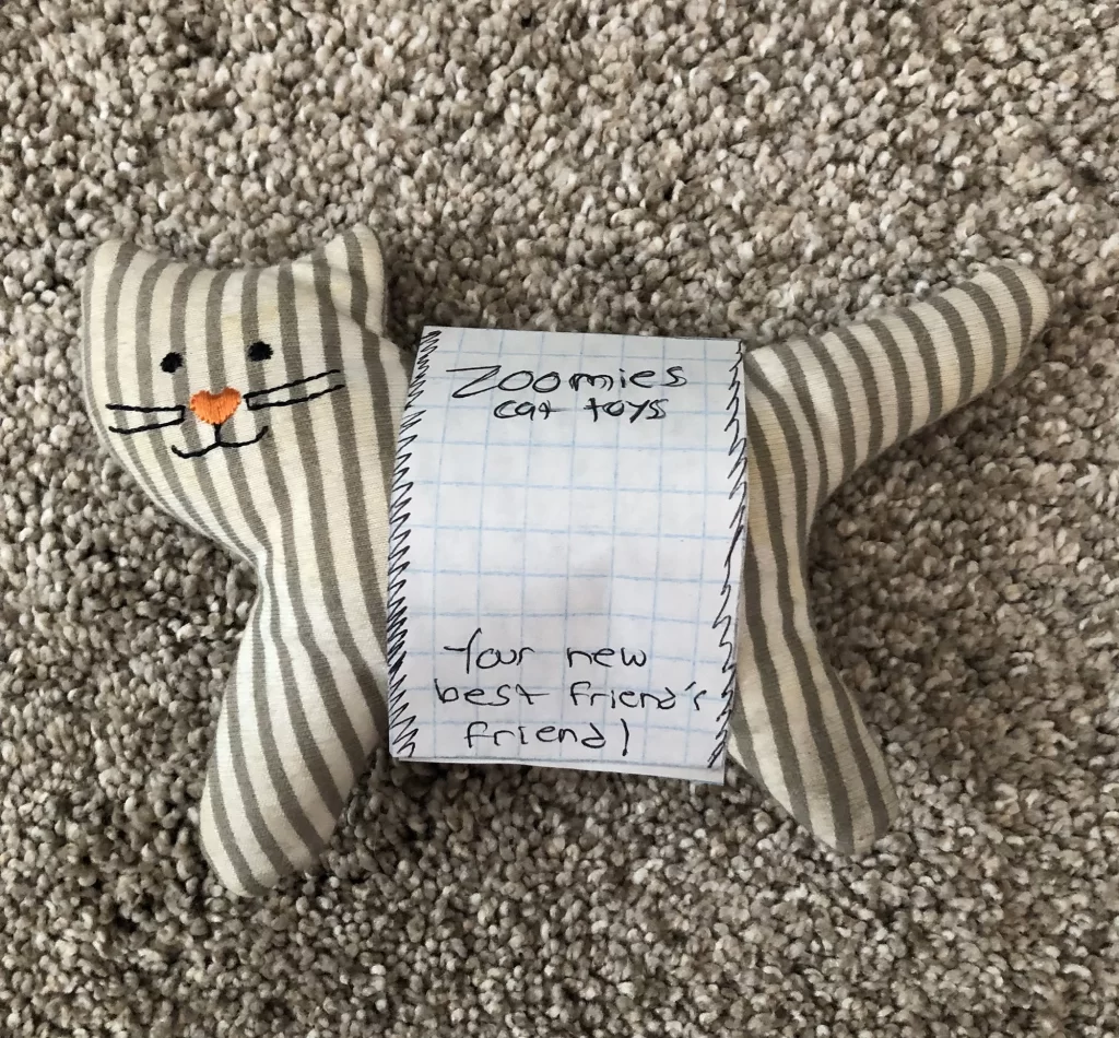
Packaging Prototyping
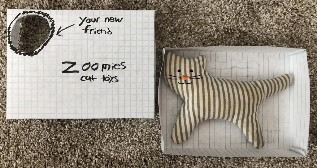
Next came the development of packaging prototypes. I created low, mid, and high-cost packaging ideas from scrap pieces of paper. The low and mid-tier packaging prototypes were simple, straight forward, and cost-effective. The low tier package was a simple rope tied around the toy with a button shaped tag and details about the product. The mid-tier package wrapped around the main body of the toy with two display panels. For the sake of improving my skills in packaging design, I settled on the high-cost prototype. This was a box with a removable lid and a circular window on the lid for the consumer to view the face of the cat toy.
Die-line Sketches
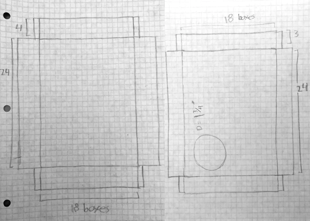
When creating the high-cost packaging, I used grid paper to establish the dimensions prior to assembly. I overlaid the toy to ensure a perfect fit. Four squares equates to one inch, so when it came time to eventually translate the die-line to digital, the measurements were already there.
Creating Homey Graphics
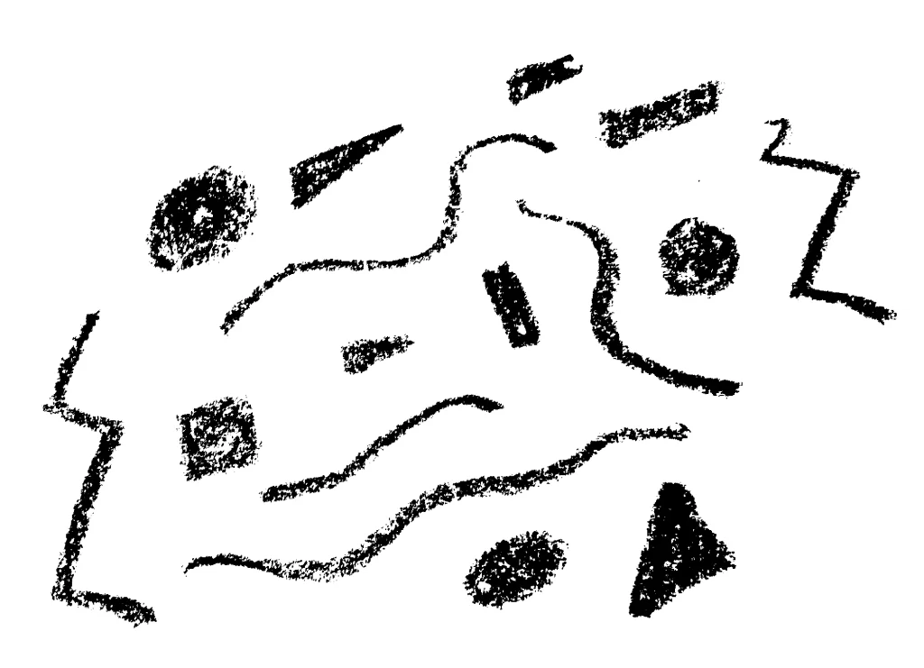
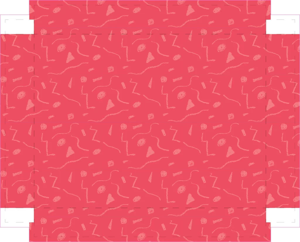
Embracing the handcrafted feel of the Zoomiez brand, I wanted to include hand-drawn illustrations and patterns. Taking a crayon on paper, I drew a couple of patterns based on cats and another based on shapes with a ‘90s aesthetic to it. I also drew words and phrases I wanted to appear on the package the same way. I then scanned the drawings in digitally, adjusted them and applied them to the die-line.
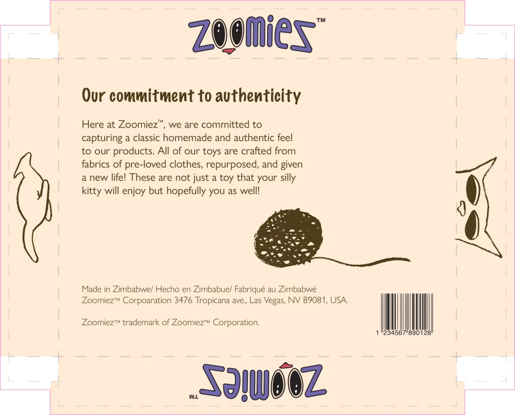
The Package
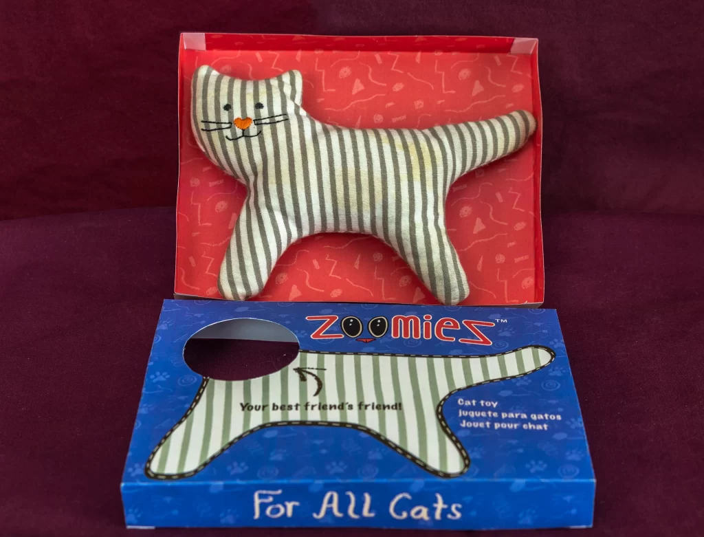
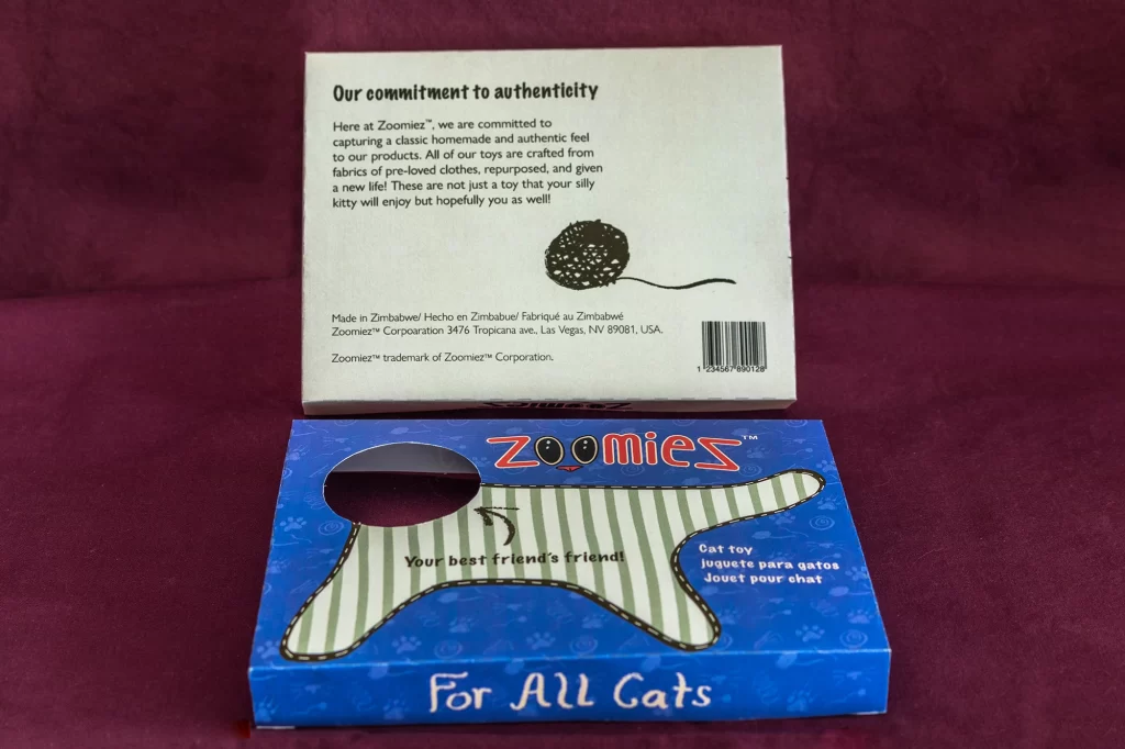
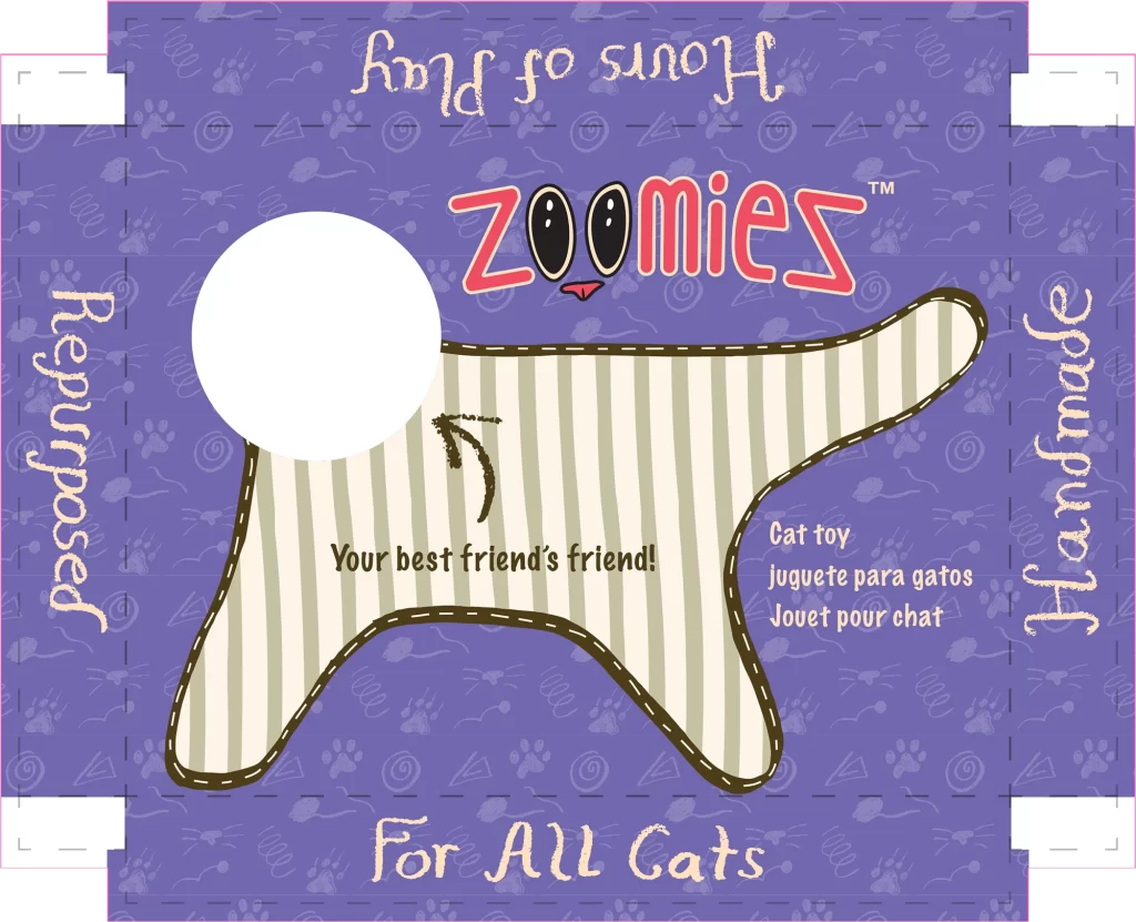
All of the branding elements were compiled into the final die-line including informational body copy and a barcode. I also illustrated the body of the toy on the lid. Even though only the face is visible, the consumer will still know what the rest of the toy looks like. I also repurposed some illustrations from my logo sketches to fill additional panels with whimsical cats.
Product Photos
Zoomiez: Your Best Friend’s Friend! – Packaging (6.25 x 4.75 x 0.75”, Printed paper, folded, photographs, July 2023)
Photographing the physical package with the toy was the final step. I used an ink jet printer and folded the package along the die-lines myself. I found some maroon bedsheets and set up a makeshift studio. It was important to capture as many sides of the package as possible. The overall process for developing Zoomiez demonstrated that almost anything can be branded or marketed, even a random cat toy. Forgetting what the original packaging of the toy looked like was beneficial for me in that it allowed me to do what I felt best encapsulated the soul of the product and embrace those aesthetics.